Tag Archives: design

From Idea to Product with Thrive at Wearable Technology Show


Specialists in wearable technology, Thrive Wearables helps companies and entrepreneurs take ideas and concepts through to finished products. At the Wearable Technology Show, I chat with Jacob, Thrive’s founder, about their design service and the challenges facing the wearable market in 2018.

To understand what Thrive do, think of a big company that sells goods that aren’t electronic in any way. Say, clothes or shoes. The clothier can see complementary wearables as an opportunity but has no knowledge or experience in the space. In this instance, it can turn to Thrive Wearables to help deliver the imagined product without the need to develop in-house skills.

Alternatively, the Thrive team can mentor startups to get their ideas to a prototype. The startup can then seek the funding needed to take the prototype to finished product.

For example, Thrive worked with BioSelf on their Sensate stress management wareable which is currently in a beta phase and taking pre-orders.

Looking to the future, Jacob sees wearable tech disappearing into clothing and becoming more modularised and seamless. Key to delivering this change are higher quality sensors, better power sources and improved communication networks. Here’s to the next few years.


Pantone Colour of the Year 2018


Moving from the earthly familiarity of last year’s Greenery, Pantone have announced Ultra Violet as the 2018 Colour of the Year. Also known as 18-3838, Ultra Violet is complex and contemplative, suggesting the mysteries of the cosmos, the intrigue of what lies ahead, and the discoveries beyond where we are now. The vast and limitless night sky is symbolic of what is possible and continues to inspire the desire to pursue a world beyond our own.

We are living in a time that requires inventiveness and imagination. It is this kind of creative inspiration that is indigenous to PANTONE 18-3838 Ultra Violet, a blue-based purple that takes our awareness and potential to a higher level,” said Leatrice Eiseman, Executive Director of the Pantone Color Institute. “From exploring new technologies and the greater galaxy, to artistic expression and spiritual reflection, intuitive Ultra Violet lights the way to what is yet to come.”

Celebrating the lives of Bowie and Prince, the colour purple has long been symbolic of counterculture, unconventionality, and artistic brilliance. These musical icons brought shades of Ultra Violet to the forefront of western pop culture as personal expressions of individuality. Nuanced and full of emotion, the depth of Ultra Violet symbolizes experimentation and non-conformity, spurring individuals to imagine their unique mark on the world, and push boundaries through creative outlets.

The full press release is here and discusses Ultra Violet in the context of everything from fashion to food.

If you are a designer, all the colour standards are on Pantone’s site, including some downloads for Adobe products. The codes for Ultra Violet Pantone 18-3838 are

  • sRGB: 95 75 139
  • CMYK: 71 73 7 8
  • HTML: 5F4B8B

I imagine this will be a popular colour with young girls! Look out for more purple in 2018.


Giant Anglepoise Lamps


Anglepoise lamps are great. They’re British, iconic, affordable, and give any desk a timeless, classic look. I particularly like the 1227 and its art deco appeal. Originally launched in 1935, it’s stood the test of time well. Having said, that it’s the 1228 that’s on my wishlist with the switch on the back of the lamp.

Not one to rest on history, Anglepoise has collaborated with a number of modern designers, including Margaret Howell and Paul Smith. I admit that I’m not a great fan of Smith’s work as his primary colours remind me too much of “My First Anglepoise”, but the press release did remind me that Anglepoise do giant versions of their lamps, three times the size of the originals.

Originally commissioned by Roald Dahl Museum and Story Centre in deference to the beloved Anglepoise lamp that Dahl used in his writing hut, inspiration for the Original 1227 Giant is part Carwardine, part fantasy.”

Sadly, these aren’t three times the price of the standard Type 75 (GB£170) and are instead a whopping GB£3,200 (approx US$4,100). Still, wouldn’t it be fabulous sitting out on a warm summer night?


Vintage Posters Galore!


The advertising posters of the mid-20th Century are incredibly evocative of a different era that ran from wartime necessity to the adventure of travel and foreign places. It’s that particular style of brash colour, typography and sheer style that draws us in.

If you’re like me, then Free Vintage Posters will be right up your street. It’s a big collection of historic posters gathered together from all across the internet into ten categories including Travel, Movies and Sports. They’re all fantastic.

Remember too that these were produced without the benefit of Illustrator or Photoshop – they’re sketched, drawn and coloured by hand before being reproduced and printed. Works of art!

You can download (relatively) hi-res images for your printing pleasure or for use a backgrounds, though usually the poster orientation isn’t a good fit for desktop monitors. Or you can simply browse through them and dream of a different time.


Google’s Round Icons Are Rubbish


Android LogoMy Pixel C upgraded to Nougat 7.1.2 at the weekend and after the obligatory reboot, I was presented with Google’s best efforts to enforce round icons across their own suite of apps. It’s embarrassingly bad. It’s one thing to create circular icons with roundness in mind, but to make round icons by slapping a white disc into the background is lazy, looks rubbish and is confusing to the user. I know Todd likes to keep GNC G-Rated but this really is a PoS. Here’s a selection of icons from my app drawer, which has a white background.

Look at Google’s icons and the way they’ve shoe-horned triangular icons into their new circular standard by putting them on a white disc. It’s sheer laziness and the design has prioritised circular compliance over aesthetic. The white disk looks indistinct against the white background and simply makes the icons appear small. Inbox and Gmail apps have suffered the same fate as well with tiny envelopes inside white circles. What were the designers thinking? At least they made some effort with Sheets and Slides…

And it’s confusing too. Compare an icon with white disc with the previous look of folders. Both are small icons inside a circle so the new icons look like old folders. On the right is what my folders look like on my phone which runs an older version of Android. Compare the folders with the new icons. Pretty similar and it confused me the first time I saw the new Inbox logo. I thought, “What’s Inbox doing in a folder?” It’s badly thought out and bad for users.

Finally, what is it with this push to round icons over all other considerations? What’s wrong with square icons, round icons, irregular icons? I don’t want my phone or tablet to look like a game of Dots with every icon a neat circle and I sincerely hope that the app developers tell Google where to shove it.


Pantone Color of the Year 2017


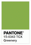
Greenery 15-0343Returning to a single colour from last year‘s paring of Rose Quartz and Serenity, Pantone’s Color of the Year is Greenery, also known as Pantone 15-0343, a refreshing and revitalising shade, symbolic of new beginnings.

Greenery is a fresh and zesty yellow-green shade that evokes the first days of spring when nature’s greens revive, restore and renew. Illustrative of flourishing foliage and the lushness of the great outdoors, the fortifying attributes of Greenery signals consumers to take a deep breath, oxygenate and reinvigorate.

Leatrice Eiseman, Executive Director of the Pantone Color Institute, says, “While Serenity and Rose Quartz expressed the need for harmony in a chaotic world, Greenery bursts forth in 2017 to provide us with the reassurance we yearn for amid a tumultuous social and political environment. Satisfying our growing desire to rejuvenate and revitalise, Greenery symbolises the re-connection we seek with nature, one another and a larger purpose.

The full press release is here and discusses Greenery in the context of everything from tech innovation to food and drink.

If you are a designer, all the colour standards are on Pantone’s site, including some downloads for Adobe products. The codes for Greenery 15-0343 TCX are

  • RGB:136 176 75
  • CMYK: 51 88 0
  • HTML: 88B04B

Look for more green in twenty seventeen!


Before Ive, There Was Rams


Braun LogoAsked to name an industrial designer, most Apple lovers will come up with Sir Jonathan “Jony” Ive, designer of iconic products such as the iMac, iPod, iPhone and iPad. Go back a few decades, and it was Braun and Dieter Rams that were synonymous with industrial design. From coffee makers and toothbrushes to calculators and radios, there’s a good chance that you’ve seen or used one of his designs.

Braun CalculatorRarely seen in the public eye, there’s a fantastic opportunity to learn more about this great designer, famous for his “Ten Principles for Good Design“. Film director, Gary Hustwit, is recording a feature-length documentary about Dieter Rams which is currently looking for funding on Kickstarter. The director has previously produced Helvectica, a documentary about typography and Objectified which looks at the relationship between objects and the designers behind them..

The project has already reached its target of US$200,000 with another two weeks to go. There’s some cool rewards (including your own private screening with the director at $5,000) but a $15 digital download is more reasonable.

To underline Dieter Ram‘s significance, there’s a trail that goes from mid-century modern straight through his work to today’s designs from Apple and Ikea. If you want to understand the consumer products you buy now, this is a must-see documentary….though you’ll have to wait until 2017.