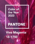
Category Archives: design

Pantone Color of the Year 2025 is Mocha Mousse


For 2025 Pantone has announced Mocha Mousse as the Color of the Year. Officially PANTONE 17-1230 Mocha Mousse, the colour is “a warming, brown hue imbued with richness. It nurtures us with its suggestion of the delectable qualities of chocolate and coffee, answering our desire for comfort.”

Leatrice Eiseman, Executive Director of the Pantone Color Institute, explains, “Underpinned by our desire for every day pleasures, PANTONE 17-1230 Mocha Mousse expresses a level of thoughtful indulgence. Sophisticated and lush, yet at the same time an unpretentious classic, Mocha Mousse extends our perceptions of the browns from being humble and grounded to embrace aspirational and luxe. Infused with subtle elegance and earthy refinement, Mocha Mousse presents a discrete and tasteful touch of glamour. A flavorful brownshade, Mocha Mousse envelopes us with its sensorial warmth.”

This year’s Mocha Mousse follows on from last year’s Peach Fuzz and for the full story on this year’s color choice, there’s a comprehensive Pantone feature on the Color of the Year. I’d suggest that this year, going from Peach Fuzz to Mocha Mousse is more of a evolution in color rather than the distinctive breaks that are more usual.

It’s also 26 years of the Pantone Color of the year. Back in 2000, it was PANTONE 15-4020 Cerulean and for those paying attention, that was the colour namechecked in The Devil Wears Prada when Andy gets a dressing down from Miranda on her choice of jumper.

As with previous years, Pantone has worked with other partners to transform Mocha Mousse into more than just colours. Continuing the existing relationship, Motorola has introduced two special edition smartphones, the edge 50 neo and the razr 50 ultra. They’re currently out of stock but you can be notified when they’re ready. In addition to this year’s Color of the Year, there are other Pantone color choices for the phones such as Poinciana and Nautical Blue.

Although there doesn’t seem to be a formal arrangement with Microsoft which was in place for 2022’s Very Peri, there are plenty of Mocha Mousse wallpapers to download. Stay bang on trend in your next online meeting.

If you are a designer, all the colour standards are on Pantone’s site, including some downloads for Adobe products. The codes for PANTONE 17-1230 Mocha Mouse are sRGB: 164 120 100 and Hex: #A47864.

Mocha Mousse imagery courtesy of Pantone. Edge and Razr photos courtesy of Motorola.


Pantone Color of the Year 2023 – Viva Magenta


For 2023 Pantone has announced Viva Magenta as the Color of the Year. Officially Pantone 18-1750, the colour vibrates with vim and vigour. It is a shade rooted in nature descending from the red family and expressive of a new signal of strength. Viva Magenta is brave and fearless, and a pulsating colour whose exuberance promotes a joyous and optimistic celebration, writing a new narrative.

Leatrice Eiseman, Executive Director of the Pantone Color Institute, explains “In this age of technology, we look to draw inspiration from nature and what is real. PANTONE 18-1750 Viva Magenta descends from the red family, and is inspired by the red of cochineal, one of the most precious dyes belonging to the natural dye family as well as one of the strongest and brightest the world has known. Rooted in the primordial, PANTONE 18-1750 Viva Magenta reconnects us to original matter. Invoking the forces of nature, PANTONE 18-1750 Viva Magenta galvanizes our spirit, helping us to build our inner strength.

This year’s Viva Magenta follows on from last year’s Very Peri, in a sequence of rich colours. For the full story on Viva Magenta, there’s a comprehensive Pantone article.

As with previous years, Pantone has worked with other partners to transform Viva Magenta into more than just colours. Brazilian footwear manufacturer Cariuma offers a range of sustainable sneakers in Pantone colours including this year’s Color of the Year. Motorola has introduced a special edition smartphone, the Edge 30 Fusion x Pantone. I have to say that it looks pretty good in Viva Magenta. Sadly, there’s no collaboration with Microsoft this year to add Viva Magenta to Teams.

If you are a designer, all the colour standards are on Pantone’s site, including some downloads for Adobe products. The codes for Viva Magenta are sRGB: 190, 52, 85 and Hex: #BE3455.

Welcome to the #Magentaverse – an unconventional shade for an unconventional time!


Pantone Color of the Year 2022 – Very Peri


For 2022, Pantone has chosen Very Peri for its Color of the Year 2022. Described in the Pantone catalogue as 17-3938, Very Peri is “a dynamic periwinkle blue hue with a vivifying violet red undertone…..Blending the faithfulness and constancy of blue with the energy and excitement of red, this happiest and warmest of all the blue hues introduces an empowering mix of newness.” I like it.

As we move into a world of unprecedented change, the selection of PANTONE 17-3938 Very Peri brings a novel perspective and vision of the trusted and beloved blue color family,” says Leatrice Eiseman, Executive Director, Pantone Color Institute. “Encompassing the qualities of the blues, yet at the same time possessing a violet-red undertone, PANTONE 17-3938 Very Peri displays a spritely, joyous attitude and dynamic presence that encourages courageous creativity and imaginative expression.”

The Pantone Color of the Year reflects what is taking place in our global culture, expressing what people are looking for that color can hope to answer,” added Laurie Pressman, Vice President of the Pantone Color Institute. “Creating a new color for the first time in the history of our Pantone Color of the Year educational color program reflects the global innovation and transformation taking place. As society continues to recognize color as a critical form of communication and as a way to express and affect ideas and emotions and engage and connect, the complexity of this new red-violet-infused blue hue highlights the expansive possibilities that lie before us.

For designers, all the colour standards are on Pantone’s site, including some downloads for Adobe products. The codes for Very Peri are sRGB: 102, 103, 171 and Hex: #6667AB.

As usual, Pantone have partnered with several companies to highlight the new colour, including Brazilian sneaker brand, Cariuma. Their sustainable kicks, such as the classic OCA Low, will feature Very Peri in a couple of different styles.

For techies and geeks, Pantone has partnered with Microsoft to bring the the Color of the Year 2022 to life in across Microsoft products – including custom Teams backgrounds, Windows wallpapers, a new Edge theme, and a PowerPoint template infused with Very Peri. That’ll make the Teams’ meeting so much more fashionable.


Pantone Colors of the Year 2021 – Illuminating and Ultimate Gray


For 2021 Pantone has announced two Colors of the Year, Illuminating and Ultimate Gray. Officially Pantone 13-0647 and 17-5104, Illuminating is a bright and cheerful yellow sparkling with vivacity, a warming yellow shade imbued with solar power. Ultimate Gray is emblematic of solid and dependable elements which are everlasting and provide a firm foundation. The colors of pebbles on the beach and natural elements whose weathered appearance highlights an ability to stand the test of time, Ultimate Gray quietly assures, encouraging feelings of composure, steadiness and resilience.

Leatrice Eiseman, Executive Director of the Pantone Color Institute, explains “The selection of two independent colors highlight how different elements come together to express a message of strength and hopefulness that is both enduring and uplifting, conveying the idea that it’s not about one color or one person, it’s about more than one. The union of an enduring Ultimate Gray with the vibrant yellow Illuminating expresses a message of positivity supported by fortitude. Practical and rock solid but at the same time warming and optimistic, this is a color combination that gives us resilience and hope. We need to feel encouraged and uplifted, this is essential to the human spirit.

As with last year’s Classic Blue, Pantone has worked with other partners to transform Illuminating and Ultimate Gray into more than just colours. Brazilian footwear manufacturer Cariuma offers a range of sneakers in Pantone colours including this year’s Colors of the Year. At the other end of the body, Love Your Melon, has a selection of woolly hats in Illuminating and Ultimate Gray. For fashion accessories, Lokai have bead bracelets incorporating the two colours – yellow on one side, gray on the other.

The Pantone Color of the Year reflects what is taking place in our global culture, expressing what people are looking for that color can hope to answer.” added Laurie Pressman, Vice President of the Pantone Color Institute. “As society continues to recognize color as a critical form of communication, and a way to symbolize thoughts and ideas, many designers and brands are embracing the language of color to engage and connect.

The full press release is here and discusses Illuminating and Ultimate Gray in the context of everything from tech innovation to interior design and fashion.

If you are a designer, all the colour standards are on Pantone’s site, including some downloads for Adobe products. The codes for Illuminating are sRGB: 245, 223, 77 and Hex: #F5DF4D.

For Ultimate Gray, the codes are sRGB: 147, 149, 151 and Hex: #939597

Personally, I see the colours reflecting the transition from despair to hope in 2021 as the world fights back against Covid-19. We need to see more Illuminating that Ultimate Gray.


The Greatest Designs of Modern Times


Back in 1959, Fortune worked with Institute of Design at the Illinois Institute of Technology (IIT) to produce The 100 “Best Designed” Products. The original article is here and within the list are objects still recognised and valued today: Barcelona chair, Anglepoise lamp, Vespa scooter, Zippo lighter, Chemex coffee maker and Leica camera. Others will be recognisable only from the history books, like the Ford Model T, and others will be bewildering, such as the IBM Time Data Punch.

Sixty years on and still working with the IIT Institute of Design, Fortune has updated the list for the 21st century: The Greatest Designs of Modern Times. This time the list is far more recognisable but has expanded into areas only dreamed of in 1959. Unsurprisingly, numerous Apple products rightly make the list with the Apple iPhone in at #1. There are online services like Uber and Netflix; long loved toys like Lego stand alongside Pokemon and Super Mario Bros; the cult Black Wing pencil makes it in at #100.

Fortunately, it’s not all post-war design and a few of the original 1959 entries make it into this list – the geodesic dome, Futura typeface and Olivetti typewriter. The designers themselves are incredible visionaries and some are household names like Jony Ive and Dieter Rams. Furniture design is particularly timeless – Ray and Charles Eames, Alvar Aalto and Eero ­Saarinen all have mid-century designs recognisable today. It’s not all expensive either: the Braun calculator and the Bialetti Moka Pot are around GB£25. The Ikea’s Billy bookcase puts in an appearance at #41.

Take a break from worries of the day and marvel at some truly wonderful Designs of Modern Times.


OnePlus Spring Cleans Logo


OnePlus and its slogan Never Settle have been on the mobile scene since 2014, and it’s become a well-known brand amongst aficionados. For sure, brand awareness isn’t up there with Apple or Samsung – my mum would have no idea who OnePlus are – but the logo’s recognisable from across the room. However, the OnePlus team have decided to give the VI (that’s Visual Identity in design-talk) a bit of a spring clean, changing the font, reversing the image, adjusting the plus. It’s nothing dramatic and I’m sure there will be both lovers and haters. I kind of liked the original blocky 1 as it had a bit of a retro vibe to it…cough, I notice that the web favicon.ico hasn’t been updated yet.

Here’s the old and new side by side.

Apparently it took over seven months to refresh the look and I’m pleased they retained the red, even if Pantone reckons that Classic Blue is the “Colour of the Year 2020”. Mats Hakansson, global creative director of OnePlus said, “OnePlus is not changing who we are, but to reinforce what we stand for – the true spirt of Never Settle. We always design for our users. We feel that these changes maintain the iconic elements of our brand that are beloved by our staff and our community, while injecting both excitement and balance into our visual identity.”

He went on, “No detail is too small. By starting from thousands of user data points, the team arrived at a new holistic visual language inspired by OnePlus’ burdenless philosophy. OnePlus has grown a lot from an idea to a major smartphone player. Introducing a fresh new look is just one example of how we continue to bring our Never Settle mantra to life.

Anyway, thrilling as this is, the benefit to consumers is that OnePlus are doing some discounts on the existing flagship, the OnePlus 7T. Starting today ’til 1st April, 2020, Europeans who purchase a OnePlus 7T from oneplus.com can use the code “SAMEONEPLUS” during check-out to get a £50/50€ discount. There’s also 20% off on the purchase of OnePlus 7 and OnePlus 7 Pro accessories and 50% off the purchase of OnePlus 6 and OnePlus 6T accessories. There’s already $100 off for Americans, so they don’t need to feel hard done by the deal.


Pantone Color of the Year 2020


Classic Blue

In contrast to last year’s Living Coral, Pantone’s Color of the Year for 2020 has been announced as Classic Blue. Officially known as Pantone 19-4052, the colour is “Suggestive of the sky at dusk, the reassuring qualities of the thought-provoking Pantone 19-4052 Classic Blue highlight our desire for a dependable and stable foundation from which to build as we cross the threshold into a new era.

Leatrice Eiseman, Executive Director of the Pantone Color Institute, explains “We are living in a time that requires trust and faith. It is this kind of constancy and confidence that is expressed by Pantone 19-4052 Classic Blue, a solid and dependable blue hue we can always rely on. Imbued with a deep resonance, Pantone 19-4052 Classic Blue provides an anchoring foundation. A boundless blue evocative of the vast and infinite evening sky, Pantone 19-4052 Classic Blue encourages us to look beyond the obvious to expand our thinking; challenging us to think more deeply, increase our perspective and open the flow of communication.

Reflecting a diverse and more inclusive world, Pantone has transformed Classic Blue beyond the visual into a multi-sensory experience. Working with partners, Classic Blue is represented in sound, touch, smell and taste. Audio UX worked with Pantone to reflect the nature of Classic Blue in sound, creating a 145 samples for download here. Fragrance and flavour company Firmenich created a taste and a smell, “a fragrant contemplation of where sky and sea meet – a boundless blue where there is no end.” There’s even a matching tea blend, over at TeaLeaves, and The Inside has created a custom fabric, Dusk, for tactile representation of Classic Blue.

Laurie Pressman, Vice President of the Pantone Color Institute expanded, “As we all head into a new era, we wanted to challenge ourselves to find inspiration from new sources that not only evolve our Color of the Year platform, but also help our global audiences achieve richer and more rewarding color experiences. This desire, combined with the emotional properties of Pantone 19-4052 Classic Blue, motivated us to expand beyond the visual, to bring the 2020 Pantone Color of the Year to life through a multi-sensory experience.

The full press release is here and discusses Classic Blue in the context of everything from tech innovation to food and drink, plus the new complementary multi-sensory approach.

Pantone Classic BlueIf you are a designer, all the colour standards are on Pantone’s site, including some downloads for Adobe products. The codes for Classic Blue 19-4052 TCX are

  • sRGB: 15 76 129
  • CMYK: 100 76 25 0
  • HTML: 0F4C81

Look for more blue in 2020! Once you start looking, you’ll be surprised how much you see.

Picture courtesy of Pantone.