Tag Archives: design

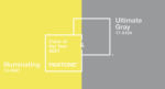
Pantone Colors of the Year 2021 – Illuminating and Ultimate Gray


For 2021 Pantone has announced two Colors of the Year, Illuminating and Ultimate Gray. Officially Pantone 13-0647 and 17-5104, Illuminating is a bright and cheerful yellow sparkling with vivacity, a warming yellow shade imbued with solar power. Ultimate Gray is emblematic of solid and dependable elements which are everlasting and provide a firm foundation. The colors of pebbles on the beach and natural elements whose weathered appearance highlights an ability to stand the test of time, Ultimate Gray quietly assures, encouraging feelings of composure, steadiness and resilience.

Leatrice Eiseman, Executive Director of the Pantone Color Institute, explains “The selection of two independent colors highlight how different elements come together to express a message of strength and hopefulness that is both enduring and uplifting, conveying the idea that it’s not about one color or one person, it’s about more than one. The union of an enduring Ultimate Gray with the vibrant yellow Illuminating expresses a message of positivity supported by fortitude. Practical and rock solid but at the same time warming and optimistic, this is a color combination that gives us resilience and hope. We need to feel encouraged and uplifted, this is essential to the human spirit.

As with last year’s Classic Blue, Pantone has worked with other partners to transform Illuminating and Ultimate Gray into more than just colours. Brazilian footwear manufacturer Cariuma offers a range of sneakers in Pantone colours including this year’s Colors of the Year. At the other end of the body, Love Your Melon, has a selection of woolly hats in Illuminating and Ultimate Gray. For fashion accessories, Lokai have bead bracelets incorporating the two colours – yellow on one side, gray on the other.

The Pantone Color of the Year reflects what is taking place in our global culture, expressing what people are looking for that color can hope to answer.” added Laurie Pressman, Vice President of the Pantone Color Institute. “As society continues to recognize color as a critical form of communication, and a way to symbolize thoughts and ideas, many designers and brands are embracing the language of color to engage and connect.

The full press release is here and discusses Illuminating and Ultimate Gray in the context of everything from tech innovation to interior design and fashion.

If you are a designer, all the colour standards are on Pantone’s site, including some downloads for Adobe products. The codes for Illuminating are sRGB: 245, 223, 77 and Hex: #F5DF4D.

For Ultimate Gray, the codes are sRGB: 147, 149, 151 and Hex: #939597

Personally, I see the colours reflecting the transition from despair to hope in 2021 as the world fights back against Covid-19. We need to see more Illuminating that Ultimate Gray.


The Greatest Designs of Modern Times


Back in 1959, Fortune worked with Institute of Design at the Illinois Institute of Technology (IIT) to produce The 100 “Best Designed” Products. The original article is here and within the list are objects still recognised and valued today: Barcelona chair, Anglepoise lamp, Vespa scooter, Zippo lighter, Chemex coffee maker and Leica camera. Others will be recognisable only from the history books, like the Ford Model T, and others will be bewildering, such as the IBM Time Data Punch.

Sixty years on and still working with the IIT Institute of Design, Fortune has updated the list for the 21st century: The Greatest Designs of Modern Times. This time the list is far more recognisable but has expanded into areas only dreamed of in 1959. Unsurprisingly, numerous Apple products rightly make the list with the Apple iPhone in at #1. There are online services like Uber and Netflix; long loved toys like Lego stand alongside Pokemon and Super Mario Bros; the cult Black Wing pencil makes it in at #100.

Fortunately, it’s not all post-war design and a few of the original 1959 entries make it into this list – the geodesic dome, Futura typeface and Olivetti typewriter. The designers themselves are incredible visionaries and some are household names like Jony Ive and Dieter Rams. Furniture design is particularly timeless – Ray and Charles Eames, Alvar Aalto and Eero ­Saarinen all have mid-century designs recognisable today. It’s not all expensive either: the Braun calculator and the Bialetti Moka Pot are around GB£25. The Ikea’s Billy bookcase puts in an appearance at #41.

Take a break from worries of the day and marvel at some truly wonderful Designs of Modern Times.


OnePlus Spring Cleans Logo


OnePlus and its slogan Never Settle have been on the mobile scene since 2014, and it’s become a well-known brand amongst aficionados. For sure, brand awareness isn’t up there with Apple or Samsung – my mum would have no idea who OnePlus are – but the logo’s recognisable from across the room. However, the OnePlus team have decided to give the VI (that’s Visual Identity in design-talk) a bit of a spring clean, changing the font, reversing the image, adjusting the plus. It’s nothing dramatic and I’m sure there will be both lovers and haters. I kind of liked the original blocky 1 as it had a bit of a retro vibe to it…cough, I notice that the web favicon.ico hasn’t been updated yet.

Here’s the old and new side by side.

Apparently it took over seven months to refresh the look and I’m pleased they retained the red, even if Pantone reckons that Classic Blue is the “Colour of the Year 2020”. Mats Hakansson, global creative director of OnePlus said, “OnePlus is not changing who we are, but to reinforce what we stand for – the true spirt of Never Settle. We always design for our users. We feel that these changes maintain the iconic elements of our brand that are beloved by our staff and our community, while injecting both excitement and balance into our visual identity.”

He went on, “No detail is too small. By starting from thousands of user data points, the team arrived at a new holistic visual language inspired by OnePlus’ burdenless philosophy. OnePlus has grown a lot from an idea to a major smartphone player. Introducing a fresh new look is just one example of how we continue to bring our Never Settle mantra to life.

Anyway, thrilling as this is, the benefit to consumers is that OnePlus are doing some discounts on the existing flagship, the OnePlus 7T. Starting today ’til 1st April, 2020, Europeans who purchase a OnePlus 7T from oneplus.com can use the code “SAMEONEPLUS” during check-out to get a £50/50€ discount. There’s also 20% off on the purchase of OnePlus 7 and OnePlus 7 Pro accessories and 50% off the purchase of OnePlus 6 and OnePlus 6T accessories. There’s already $100 off for Americans, so they don’t need to feel hard done by the deal.


Pantone Color of the Year 2020


Classic Blue

In contrast to last year’s Living Coral, Pantone’s Color of the Year for 2020 has been announced as Classic Blue. Officially known as Pantone 19-4052, the colour is “Suggestive of the sky at dusk, the reassuring qualities of the thought-provoking Pantone 19-4052 Classic Blue highlight our desire for a dependable and stable foundation from which to build as we cross the threshold into a new era.

Leatrice Eiseman, Executive Director of the Pantone Color Institute, explains “We are living in a time that requires trust and faith. It is this kind of constancy and confidence that is expressed by Pantone 19-4052 Classic Blue, a solid and dependable blue hue we can always rely on. Imbued with a deep resonance, Pantone 19-4052 Classic Blue provides an anchoring foundation. A boundless blue evocative of the vast and infinite evening sky, Pantone 19-4052 Classic Blue encourages us to look beyond the obvious to expand our thinking; challenging us to think more deeply, increase our perspective and open the flow of communication.

Reflecting a diverse and more inclusive world, Pantone has transformed Classic Blue beyond the visual into a multi-sensory experience. Working with partners, Classic Blue is represented in sound, touch, smell and taste. Audio UX worked with Pantone to reflect the nature of Classic Blue in sound, creating a 145 samples for download here. Fragrance and flavour company Firmenich created a taste and a smell, “a fragrant contemplation of where sky and sea meet – a boundless blue where there is no end.” There’s even a matching tea blend, over at TeaLeaves, and The Inside has created a custom fabric, Dusk, for tactile representation of Classic Blue.

Laurie Pressman, Vice President of the Pantone Color Institute expanded, “As we all head into a new era, we wanted to challenge ourselves to find inspiration from new sources that not only evolve our Color of the Year platform, but also help our global audiences achieve richer and more rewarding color experiences. This desire, combined with the emotional properties of Pantone 19-4052 Classic Blue, motivated us to expand beyond the visual, to bring the 2020 Pantone Color of the Year to life through a multi-sensory experience.

The full press release is here and discusses Classic Blue in the context of everything from tech innovation to food and drink, plus the new complementary multi-sensory approach.

Pantone Classic BlueIf you are a designer, all the colour standards are on Pantone’s site, including some downloads for Adobe products. The codes for Classic Blue 19-4052 TCX are

  • sRGB: 15 76 129
  • CMYK: 100 76 25 0
  • HTML: 0F4C81

Look for more blue in 2020! Once you start looking, you’ll be surprised how much you see.

Picture courtesy of Pantone.


New Design for Anglepoise with the Type 80


Anglepoise LogoLong-time readers of GNC will know that I’m a bit of an Anglepoise fan (I did a photo review of the Type 75 Mini back in 2014). The designs are clever mixes of detailed engineering and superb convenience. Anglepoise Type 80 Table LampAnd while the balance mechanisms might take the glory, the convenience of a power switch on the back of the lamp head is understated – check out the Type 1228. Anyone who appreciates Apple’s product design should enjoy Anglepoise too.

Many of Anglepoise’s designs date back decades to George Carwardine‘s original models. Style never goes out of fashion, but new types and designs don’t exactly flow out of Anglepoise on a regular basis. According to their history, the previous completely new design was the Type C in 2011, and that’s not currently available either.

Fortunately, there’s good news with the arrival of the Anglepoise Type 80. Designed by Sir Kenneth Grange, the new Type 80 lamp shade features a halo of light (look at the picture) which illuminates the outside of the shade, and the design eschews the triple spring balance mechanism in favour of a new sprung joint.

In the history of domestic lighting there is one truly iconic element and it must surely be the conical shade, so it is right that Anglepoise should have such a classic iconic design in their portfolio. Moreover, with every new model that we launch there is an innovation, no matter how modest. With the Type 80 the visual attraction of light spilling onto the shade outer surface aims to make the iconic even more distinguished.

To celebrate the new design, Anglepoise have produced a limited edition set of twenty postcards that celebrate the work of Sir Kenneth Grange. Early orders of Type 80 designs will get a set thrown in for free.

As a fan, what do I think? I miss the classic spring balance but it does give a more minimalist look.

The Type 80 collection is available in rose pink, pistachio, grey mist and matte black. Available direct from Anglepoise and John Lewis in the UK. The lamp shown above right costs GB£199.


City of Phoenix Offers Free Sustainable Home Design Plans


Home Design Plans CompetitionRooted firmly in mid-century modern design and with a nod to Frank Lloyd Wright’s Usonian houses, the City of Phoenix and the American Institute of Architects ran a “Sustainable Home Design Competition for a ‘near net-zero energy’ single family home” in 2018.

The design was to be for a house in climate zone 2, which indicates a need primarily for cooling, and was part of the City’s goal to become a carbon-neutral and zero-waste city. As a step towards achieving these goals, the City of Phoenix wanted to encourage the construction of ultra-low energy use homes.

The prize was US$100,000 and the winning design, Home NZ, came from Marlene Imirzian & Associates Architects, in partnership with SCL Consulting, Henderson Engineers and Desert Skies Energy Services.

The building is 2,185 square feet and sits on 60′ by 110′ lot. Inside there are three bedrooms, family and living rooms, kitchen, laundry, bathroom and garage for a build cost around US$350,000. As built, it has a Home Energy Rating System (HERS) index of 33 but with the addition of renewable energy sources (solar), this falls to 0. For comparison, a standard new home has a HERS rating of around 100.

Home NZ Side View

By using heat reflective glazing, passive cooling and natural convection, plus low energy lighting and smart systems, the Home NZ can expect to save around $2,000 in comparison to a similar standard property. Of course, it’s not just about saving money, it’s about saving the planet…

These competitions are often great exemplars of technology, but in this case, it’s an affordable family home that can be built today. And even better, the City of Phoenix has made the plans available for free. All you have to do is go here, sign the disclaimer, and download 88 MB of pdf.

And if you are ever in the Phoenix area, I’d recommend a trip to Taliesin West in neighbouring Scottsdale to learn more about Frank Lloyd Wright.


Pantone Color of the Year 2019


Last year, Pantone’s Color of 2018 took us to outer space with Ultra Violet. This year’s takes us to Earth’s inner space with Living Coral announced as Pantone’s Color of the Year for 2019. Officially known as Pantone 16-1546, the colour is “an animating and life-affirming coral hue with a golden undertone that energizes and enlivens with a softer edge.

Pantone goes on to say, “In reaction to the onslaught of digital technology and social media increasingly embedding into daily life, we are seeking authentic and immersive experiences that enable connection and intimacy. Sociable and spirited, the engaging nature of PANTONE 16-1546 Living Coral welcomes and encourages lighthearted activity. Symbolizing our innate need for optimism and joyful pursuits, Pantone 16-1546 Living Coral embodies our desire for playful expression.

Leatrice Eiseman, Executive Director of the Pantone Color Institute, says, “Color is an equalizing lens through which we experience our natural and digital realities and this is particularly true for Living Coral. With consumers craving human interaction and social connection, the humanizing and heartening qualities displayed by the convivial Pantone Living Coral hit a responsive chord.

The full press release is here and discusses Living Coral in the context of everything from tech innovation to food and drink. For social media, it suggests that, “An organic shade, Living Coral is striking in digital mediums, evoking the same inspirational feeling ignited by our natural surroundings. Living Coral’s vibrancy and buoyancy captivates our attention in social media and digital design.

If you are a designer, all the colour standards are on Pantone’s site, including some downloads for Adobe products. The codes for Living Coral 16-1546 TCX are

  • RGB: 255 111 97
  • CMYK: 0 65 54 0
  • HTML: FF6F61

Look for more coral in 2019! Once you start looking, you’ll be surprised how much you see.

Picture courtesy of Pantone.