Tag Archives: colour

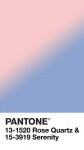
Pantone Color of the Year 2016


Pantone Color 2016Pantone has announced its Color of the Year for 2016 and for the first time ever, the chosen color is a blend of two, Rose Quartz and Serenity. “Why two?” you might reasonably ask….

Pantone says, “As consumers seek mindfulness and well-being as an antidote to modern day stresses, welcoming colors that psychologically fulfil our yearning for reassurance and security are becoming more prominent. Joined together, Rose Quartz and Serenity demonstrate an inherent balance between a warmer embracing rose tone and the cooler tranquil blue, reflecting connection and wellness as well as a soothing sense of order and peace.

PANTONE-Color-of-the-Year-2016-v5-1080x1920By choosing the combination of girl pink and boy blue, Pantone is making a socio-political statement too.
In many parts of the world we are experiencing a gender blur as it relates to fashion, which has in turn impacted color trends throughout all other areas of design. This more unilateral approach to color is coinciding with societal movements toward gender equality and fluidity, the consumer’s increased comfort with using color as a form of expression, a generation that has less concern about being typecast or judged and an open exchange of digital information that has opened our eyes to different approaches to color usage.” 

For the graphic artists and web designers, Rose Quartz is Pantone 13-1520, #F7CAC9, and Serenity is Pantone 15-3919, #92A8D1. The full colour standards are available from Pantone.

For fashion aficionados, Pantone has prepared a series of desktop wallpapers so you can really show off your cool color credentials.

As ever, we can expect to see these Rose Quartz and Serenity incorporated into fashion and design over the coming year, though given the similarity to baby colors, it will be tricky to spot the real trends. Last year’s color, Marsala, is now officially out of favour.


Pantone Colour of the Year 2014


Radiant OrchidWith the last month of 2013 upon us, it’s time for Pantone to declare its “Colour of the Year” for 2014, which this year is going to be…..wait for it…..Radiant Orchid, “An enchanting harmony of fuchsia, purple and pink undertones, Radiant Orchid inspires confidence and emanates great joy, love and health. It is a captivating purple, one that draws you in with its beguiling charm.”

Also known as Pantone 18-3224, Radiant Orchid “reaches across the colour wheel to intrigue the eye and spark the imagination,” said Leatrice Eiseman, executive director of the Pantone Color Institute. “An invitation to innovation, Radiant Orchid encourages expanded creativity and originality, which is increasingly valued in today’s society.

The colour data for Radiant Orchid is here, giving RGB and CMYK values for ultra-chic illustrators and designers. Web gurus should note that the HTML value is #B163A3. There’s a video discussing how the Colour of the Year is selected too.

Pantone have the usual range of complementary accessories in the Pantone Universe (seriously!) including these fun Chip Drives, and the Spring Colour Report will feature Radiant Orchid prominently.

2013’s Colour of the Year was Emerald,  “A lively, radiant, lush green, a colour of elegance and beauty that enhances our sense of well-being, balance and harmony” and 2012 was Tangerine Tango, “a spirited reddish orange, [which] continues to provide the energy boost we need to recharge and move forward”. Honeysuckle, from 2011, is a distant memory.

Perhaps Todd should incorporate Radiant Orchid into the next GNC redesign. Green is so last year.


Pantone Colour of the Year 2013


Pantone Colour of the Year EmeraldPantone has announced the Colour of the Year and…drum roll please…it’s Emerald aka 17-5641. “A lively, radiant, lush green, a colour of elegance and beauty that enhances our sense of well-being, balance and harmony” says Pantone.

Green is the most abundant hue in nature – the human eye sees more green than any other colour in the spectrum,” said Leatrice Eiseman, executive director of the Pantone Color Institute. “As it has throughout history, multifaceted Emerald continues to sparkle and fascinate. Symbolically, Emerald brings a sense of clarity, renewal and rejuvenation, which is so important in today’s complex world. This powerful and universally appealing tone translates easily to both fashion and home interiors.

The colour data for Emerald is here, giving RGB and CMYK values for illustrators and designers who want to be in with the cool crowd. There are several tie-in products, including Pantone’s Fashion Colour Report for Spring 2013, which showcases Emerald incorporated into the collections of several well-known designers, such as Tracy Reese and Nanette Lepore. From February, Pantone bedding, pillows, bath towels and accessories in Emerald will be available exclusively at JC Penney stores and on online. There are plenty of other accessories, including iPhone cases, in Pantone’s online store.

Last year’s colour, Tangerine Tango, is now out.


Superhero RGB Colours


The summer superhero season is in full swing with Spiderman already in theatres and Batman returning shortly. Each superhero has their own outfit, both instantly recognisable yet disguising at the same time.

Art Director Gidi Vigo has matched the key colours from nine superheroes to their respective RGB colours, so the next time you need some superhero duds, you know what to ask for.

Daredevil Hellboy 

Green Lantern The Hulk Green Hornet

Doctor Manhattan Superman Captain America

All images courtesy of Gidi Vigo.


Pantone Colour of the Year 2012


Pantone Tangerine TangoFor the fashionista geeks out there, Pantone has released its Colour of the Year for 2012. It’s going to be Tangerine Tango, “a spirited reddish orange, [which] continues to provide the energy boost we need to recharge and move forwardIn Pantone’s Color System, it’s 17-1463.

Sophisticated but at the same time dramatic and seductive, Tangerine Tango is an orange with a lot of depth to it,” said Leatrice Eiseman, executive director of the Pantone Color Institute. “Reminiscent of the radiant shadings of a sunset, Tangerine Tango marries the vivaciousness and adrenaline rush of red with the friendliness and warmth of yellow, to form a high-visibility, magnetic hue that emanates heat and energy.

The colour data for Tangerine Tango is here, giving RGB and CMYK values for illustrators and designers who want to be in with the cool crowd. There are several tie-in products, including Pantone’s Colour Fashion Report for Spring 2012, which showcases Tangerine Tango incorporated into the collections of several well-known designers, such Tommy Hilfiger. More practically, there are colour guides, swatches and the ubiquitous chips.

2011’s colour, Honeysuckle, is now officially passé.


Pantone The 20th Century in Color


Pantone The 20th Century in ColorPANTONE The 20th Century in Color looks to me like a great Christmas gift for anyone interested in colour and history: graphic designers, interior decorators, costume designers, website builders, Renaissance geeks. Authored by Leatrice Eiseman and Keith Recker and published last month, it’s a view of the last century with a focus on colour. Of course, it inserts the relevant Pantone colours allowing you to recreate colour schemes from the past to great effect.

The blurb says, “Pantone, the worldwide color authority, invites you on a rich visual tour of 100 transformative years. From the Pale Gold (15-0927 TPX) and Almost Mauve (12-2103 TPX) of the 1900 Universal Exposition in Paris to the Rust (18-1248 TPX) and Midnight Navy (19-4110 TPX) of the countdown to the Millennium, the 20th century brimmed with color. Longtime Pantone collaborators and color gurus Leatrice Eiseman and Keith Recker identify more than 200 touchstone works of art, products, decor, and fashion, and carefully match them with 80 different official Pantone Color palettes to reveal the trends, radical shifts, and resurgences of various hues. This vibrant volume takes the social temperature of our recent history with the panache that is uniquely Pantone.

Hyperbole aside, I think this will be fascinating look back through the past century and will be more than just a coffee table book: it’ll be a source of inspiration for when you want to get that “period feel”. It’s on my Amazon wish list so with luck, I’ll be able to bring you a review in the New Year.

(You’ll just have to forgive the twin spellings of colour and color in this article.)