Category Archives: design

City of Phoenix Offers Free Sustainable Home Design Plans


Home Design Plans CompetitionRooted firmly in mid-century modern design and with a nod to Frank Lloyd Wright’s Usonian houses, the City of Phoenix and the American Institute of Architects ran a “Sustainable Home Design Competition for a ‘near net-zero energy’ single family home” in 2018.

The design was to be for a house in climate zone 2, which indicates a need primarily for cooling, and was part of the City’s goal to become a carbon-neutral and zero-waste city. As a step towards achieving these goals, the City of Phoenix wanted to encourage the construction of ultra-low energy use homes.

The prize was US$100,000 and the winning design, Home NZ, came from Marlene Imirzian & Associates Architects, in partnership with SCL Consulting, Henderson Engineers and Desert Skies Energy Services.

The building is 2,185 square feet and sits on 60′ by 110′ lot. Inside there are three bedrooms, family and living rooms, kitchen, laundry, bathroom and garage for a build cost around US$350,000. As built, it has a Home Energy Rating System (HERS) index of 33 but with the addition of renewable energy sources (solar), this falls to 0. For comparison, a standard new home has a HERS rating of around 100.

Home NZ Side View

By using heat reflective glazing, passive cooling and natural convection, plus low energy lighting and smart systems, the Home NZ can expect to save around $2,000 in comparison to a similar standard property. Of course, it’s not just about saving money, it’s about saving the planet…

These competitions are often great exemplars of technology, but in this case, it’s an affordable family home that can be built today. And even better, the City of Phoenix has made the plans available for free. All you have to do is go here, sign the disclaimer, and download 88 MB of pdf.

And if you are ever in the Phoenix area, I’d recommend a trip to Taliesin West in neighbouring Scottsdale to learn more about Frank Lloyd Wright.


Pantone Color of the Year 2019


Last year, Pantone’s Color of 2018 took us to outer space with Ultra Violet. This year’s takes us to Earth’s inner space with Living Coral announced as Pantone’s Color of the Year for 2019. Officially known as Pantone 16-1546, the colour is “an animating and life-affirming coral hue with a golden undertone that energizes and enlivens with a softer edge.

Pantone goes on to say, “In reaction to the onslaught of digital technology and social media increasingly embedding into daily life, we are seeking authentic and immersive experiences that enable connection and intimacy. Sociable and spirited, the engaging nature of PANTONE 16-1546 Living Coral welcomes and encourages lighthearted activity. Symbolizing our innate need for optimism and joyful pursuits, Pantone 16-1546 Living Coral embodies our desire for playful expression.

Leatrice Eiseman, Executive Director of the Pantone Color Institute, says, “Color is an equalizing lens through which we experience our natural and digital realities and this is particularly true for Living Coral. With consumers craving human interaction and social connection, the humanizing and heartening qualities displayed by the convivial Pantone Living Coral hit a responsive chord.

The full press release is here and discusses Living Coral in the context of everything from tech innovation to food and drink. For social media, it suggests that, “An organic shade, Living Coral is striking in digital mediums, evoking the same inspirational feeling ignited by our natural surroundings. Living Coral’s vibrancy and buoyancy captivates our attention in social media and digital design.

If you are a designer, all the colour standards are on Pantone’s site, including some downloads for Adobe products. The codes for Living Coral 16-1546 TCX are

  • RGB: 255 111 97
  • CMYK: 0 65 54 0
  • HTML: FF6F61

Look for more coral in 2019! Once you start looking, you’ll be surprised how much you see.

Picture courtesy of Pantone.


Anglepoise Goes Small with the 90 Mini Mini


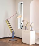
Anglepoise lamps are classic, timeless designs, with a pedigree going back to the 1930’s. As any company with history, Anglepoise improves and updates the lamps, remaining faithful to its heritage. Last year, Anglepoise brought out a giant version of the Type 75, standing over 2 m tall.

This year, Anglepoise have gone the other way with a small edition of the Model 90, which was originally produced in the 1970’s. The 90 Mini Mini is less than 50 cm high, making it the perfect desktop companion. Even better, the 90 Mini Mini is USB-powered with an integrated dimmable LED that’s rated for 20,000 hours.

Anglepoise already have small versions of other lamps, including the Type 75 Mini and Original 1227 Mini.

The 90 Mini Mini is available in three colours: Steel Blue & Grey, Warm Silver & Blush and Carbon Black & Black. It’s priced at GB£95 and is available from the Anglepoise website.

Seems that they’re all sold out except for the Steel Blue & Grey one. Must be popular. I still want a Type 1228….


Pantone Colour of the Year 2018


Moving from the earthly familiarity of last year’s Greenery, Pantone have announced Ultra Violet as the 2018 Colour of the Year. Also known as 18-3838, Ultra Violet is complex and contemplative, suggesting the mysteries of the cosmos, the intrigue of what lies ahead, and the discoveries beyond where we are now. The vast and limitless night sky is symbolic of what is possible and continues to inspire the desire to pursue a world beyond our own.

We are living in a time that requires inventiveness and imagination. It is this kind of creative inspiration that is indigenous to PANTONE 18-3838 Ultra Violet, a blue-based purple that takes our awareness and potential to a higher level,” said Leatrice Eiseman, Executive Director of the Pantone Color Institute. “From exploring new technologies and the greater galaxy, to artistic expression and spiritual reflection, intuitive Ultra Violet lights the way to what is yet to come.”

Celebrating the lives of Bowie and Prince, the colour purple has long been symbolic of counterculture, unconventionality, and artistic brilliance. These musical icons brought shades of Ultra Violet to the forefront of western pop culture as personal expressions of individuality. Nuanced and full of emotion, the depth of Ultra Violet symbolizes experimentation and non-conformity, spurring individuals to imagine their unique mark on the world, and push boundaries through creative outlets.

The full press release is here and discusses Ultra Violet in the context of everything from fashion to food.

If you are a designer, all the colour standards are on Pantone’s site, including some downloads for Adobe products. The codes for Ultra Violet Pantone 18-3838 are

  • sRGB: 95 75 139
  • CMYK: 71 73 7 8
  • HTML: 5F4B8B

I imagine this will be a popular colour with young girls! Look out for more purple in 2018.


Giant Anglepoise Lamps


Anglepoise lamps are great. They’re British, iconic, affordable, and give any desk a timeless, classic look. I particularly like the 1227 and its art deco appeal. Originally launched in 1935, it’s stood the test of time well. Having said, that it’s the 1228 that’s on my wishlist with the switch on the back of the lamp.

Not one to rest on history, Anglepoise has collaborated with a number of modern designers, including Margaret Howell and Paul Smith. I admit that I’m not a great fan of Smith’s work as his primary colours remind me too much of “My First Anglepoise”, but the press release did remind me that Anglepoise do giant versions of their lamps, three times the size of the originals.

Originally commissioned by Roald Dahl Museum and Story Centre in deference to the beloved Anglepoise lamp that Dahl used in his writing hut, inspiration for the Original 1227 Giant is part Carwardine, part fantasy.”

Sadly, these aren’t three times the price of the standard Type 75 (GB£170) and are instead a whopping GB£3,200 (approx US$4,100). Still, wouldn’t it be fabulous sitting out on a warm summer night?


Vintage Posters Galore!


The advertising posters of the mid-20th Century are incredibly evocative of a different era that ran from wartime necessity to the adventure of travel and foreign places. It’s that particular style of brash colour, typography and sheer style that draws us in.

If you’re like me, then Free Vintage Posters will be right up your street. It’s a big collection of historic posters gathered together from all across the internet into ten categories including Travel, Movies and Sports. They’re all fantastic.

Remember too that these were produced without the benefit of Illustrator or Photoshop – they’re sketched, drawn and coloured by hand before being reproduced and printed. Works of art!

You can download (relatively) hi-res images for your printing pleasure or for use a backgrounds, though usually the poster orientation isn’t a good fit for desktop monitors. Or you can simply browse through them and dream of a different time.


Google’s Round Icons Are Rubbish


Android LogoMy Pixel C upgraded to Nougat 7.1.2 at the weekend and after the obligatory reboot, I was presented with Google’s best efforts to enforce round icons across their own suite of apps. It’s embarrassingly bad. It’s one thing to create circular icons with roundness in mind, but to make round icons by slapping a white disc into the background is lazy, looks rubbish and is confusing to the user. I know Todd likes to keep GNC G-Rated but this really is a PoS. Here’s a selection of icons from my app drawer, which has a white background.

Look at Google’s icons and the way they’ve shoe-horned triangular icons into their new circular standard by putting them on a white disc. It’s sheer laziness and the design has prioritised circular compliance over aesthetic. The white disk looks indistinct against the white background and simply makes the icons appear small. Inbox and Gmail apps have suffered the same fate as well with tiny envelopes inside white circles. What were the designers thinking? At least they made some effort with Sheets and Slides…

And it’s confusing too. Compare an icon with white disc with the previous look of folders. Both are small icons inside a circle so the new icons look like old folders. On the right is what my folders look like on my phone which runs an older version of Android. Compare the folders with the new icons. Pretty similar and it confused me the first time I saw the new Inbox logo. I thought, “What’s Inbox doing in a folder?” It’s badly thought out and bad for users.

Finally, what is it with this push to round icons over all other considerations? What’s wrong with square icons, round icons, irregular icons? I don’t want my phone or tablet to look like a game of Dots with every icon a neat circle and I sincerely hope that the app developers tell Google where to shove it.