Tag Archives: Website

Unscrupulous Scruples: Watch where you click.


antivirus

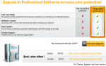
I’ve been seeing this more and more. You have to upgrade a product – a home (free) edition or something. You press the link and it sends you to a page that talks about upgrading. In fact, everything this page screams is “We don’t have the free version, you must buy an upgrade to continue”.

But if you scan the page, you see on the bottom in small print “No thanks. Register the Free version”.

Another case in point: I was searching for Drivers for a friends computer. I got to the companies webpage and selected what I thought was the driver. Instead, it shuttled me to download a program that would then collect information on my PC and find the right drivers.

It was not malware, but more of Bloatware. And that program wasn’t afraid to do the same thing – ask to install more Bloatware.

This practice is on the verge of misleading. You have to really scan pages to make sure you are selecting the right option.

Case in point #2: There is a great website out there that helps webmasters. We won’t get into the name, because this is not a witch hunt. I will say that when you purchase something on their site, you are taken to a page that looks like you have to press an “OK” button. However, this button is not to OK the purchase, but to add additional services. By scanning down the page, you find the “No thanks – Continue” option stuffed in the bottom part of the page.

In advertising creation, you learn a little trick. When an eye hits an ad, they instinctively start in the middle and work clockwise around the ad. Therefore, you put your “Hook” in the middle and the other items on the sides, including the name of the product.

What these sites have done is made the ad, but then put the “No thanks” in a spot where upon first glance, the eye will miss.

I just bought my ticket for Blogworld / New Media Expo. I used a discount site to purchase the plane ticket and hotel. After making the initial purchase, I was inundated with options I should look at. I suppose it’s so the discount site can offer lower fares. Once again, I had to carefully scan for the “No Thanks” option, although those other buttons looked like they were part of the processing.

Recently, people have been finding extra charges on their credit cards. They went to an online shopping site and chose the great deal of the day. They then pressed a button that looked legitimate to sign up for monthly deals (or something like that). Of course, those deals came with a price.

I really think that the FTC needs to start recognizing these little nuances in websites. It would be like if you went to the grocery store and the clerk started asking “Should I also add in a gallon of milk?” even if you didn’t grab milk.

As for this upgrade – I understand you need to make money off the product, but being sneaky about doing it is only going to make me go somewhere else. Put the “No thanks” in a more visible area. The consumer will buy your product if they don’t feel they are getting swindled.


EduFire says it can help students learn and teachers make extra money


edufireA couple years ago, I talked with a friend who was a teacher. We put together an idea for a website to help teach. It never made it off the planning stages, but I knew something would eventually come along.

It’s hailed as the “eBay for teachers”.  EduFire is a site that has been around for a year and has over five thousand teachers creating hundreds of classes with over 30 thousand students. For $30 a month, you get a Superpass to all courses.

Teachers get a cut of all students that take their lessons. EduFire gets 85% commission. It’s not unlike a musician renting a practice room for lessons or a personal trainer for a Pilate session. A good teacher that gets hundreds of students per course could easily make some good extra cash.

But is it a quality education system?

With five thousand teachers and growing, you would have to keep up with the content being published. There seems to be no accreditation needed to teach or tutor. Sign up for an account and go.

There is a “Tutor score” to weed out the bad ones. 1-4 = minus 1 point, 5-6 = 0 points and 7-10 – 1 point.

Still, it might be a great place for your kid to get the extra help needed to pass the ACT, or improve an individual academic. It even looks like a place to help those kids who have English as a second language. The flash card section is also pretty interesting.

Bottom line – if your child is partaking in the course, keep an eye on it. Make sure they are not giving misinformation. If you are a teacher, it could be some good extra money, but make sure it’s not going to cause any problems with your regular job.

As for my friend, I am going to point her in this direction. It looks like everything we discussed a couple years ago. I think this will be right up her alley.


Mini Review of SquareSpace.Com


From time-to-time I develop websites for clients and they generally want something reasonable (cheap) and easy to Squarespacemaintain. I’ve been hearing about a new company, SquareSpace, and how great it was so I decided to try it for myself. I was generating a proposal to update a website and decided to implement a prototype in Squarespace so the client could actually test drive my ideas.

I signed up for the 14 day free trial and watched a few “getting started” videos to help understand the interface. The site uses a visual interface and it’s very easy to get started. You pick a template style and color scheme depending on the type of site you want to create: blog, photo gallery, commercial/business. The templates are just a starting point because everything can be customized. You can even start with a blank screen and build your site from scratch. The templates are really CSS (Cascading Style Sheets) pages that can be customized by a visual interface or directly adding/modifying the CSS code.

In the site editor you can add pages and sections in sidebars that appear on every page. When you create a page or section you specify what “widget” to use. Widgets determine the type of content you want to add (journal/blog, html/text, links, search, map, forum, etc.). You can add/remove widgets and even change templates on the fly.

The site editor has four modes: Style Editor, Structure Editor, Content Editor, and Preview. The Style editor is where you pick/change your template, change column layouts, adjust fonts, colors and sizes, and customize the CSS. The Structure editor is where you add sections and pages. The Content editor is the section you will use the most after your site is configured the way you want it. This is where you add blog content, upload photos to your gallery, and change the information that your visitors will see. The last mode, Preview, shows you what your visitors will see when they visit your site.

Since this is a mini review I won’t go into all the details but I will tell you that I had a simple site up and running in four hours without any CSS or HTML coding. The site was mostly functional but it didn’t have the exact look and feel I wanted. I started switching templates to find a feature or a look I wanted for certain parts of my site and looked to see how it was implemented. In some cases it was a simple setting change in the visual interface and in others it was CSS overrides that made the difference (this is where watching the advanced help videos really helped). In one case I wanted to create a HTML page and add links to other pages. Since the linked pages were not created through the normal “add page” process, I couldn’t find a way to do it. I searched the Squarespace Help forum and found a mention of creating a hidden section on the sidebar and creating my pages there. This worked but seemed to be a kludge in the overall design.

Squarespace pricing starts out at $8/month for the Basic package and runs to $50/month for the Community package. You will need the $14/month Pro package if you want to map the website you create to your own domain name.

Pros:

  • Easy to create a website in minutes.
  • Lots of features for creating, maintaining, and monitoring your site.
  • Import content from other blogging sites: WordPress, Movable Type/Type Pad, and Blogger.
  • Detailed website analytics available.
  • Private site areas (password protected) and multiple editors.
  • Supports RSS and iTunes tags.
  • 100% customizable.
  • Great pricing.

Cons:

  • Website must be hosted by SquareSpace.
  • May require some HTML and CSS knowledge to really tweak the site the way you want (you may need to hire a consultant to finish the design).
  • No direct support for adding audio and video content. You can embed flash players using HTML Injection points but that feature is not available in the Basic or Pro packages. This may be supported with new widgets in the future.

In conclusion I was very impressed with what Squarespace offers. They have so many great features that I can’t possibly talked about of all of them here. I would suggest checking it out for yourself (14 day free trial) if for no other reason than to see how easy it is to create your own website.

73’s, Tom


The Real Mac Pros


Have you ever wondered how many of the worlds greatest special effects for major motion pictures are created? How about what kind of computing horse power is required to decode the human genome, or even what kind of technology is in the backpack of the world best photographers.

There’s a portion of the Apple site that you might not be familiar with where the rubber meets the road as far as how the jobs really get done and Apple’s role in that work. You can check out the Apple Pro website and learn about design, film & video, music & audio, photo and science. The site contains these wonder mini-profiles of specific projects in the various categories. When I need a source of inspiration, I head over here to see how my cohorts in the industry make their magic happen.


Personalize Google and Get a Gmail Invitation


Today, in direct competition with MSN and Yahoo!, Google, Inc. announced that users may create a personalized Google homepage for news, weather, cultural tidbits, and e-mail.

Continue reading Personalize Google and Get a Gmail Invitation


Whose Website Is It, Anyway?


Glitzy graphics showcasing this year’s latest technological developments, surveys and questionnaires supported by product literature designed to help prospects select the models that best fit their needs or technical support FAQs and repair diagrams that facilitate self-repair and minimize the number of request for telephone and onsite technical service: which of these services is the focus of the company’s website? Maybe, all three?

Earlier this year, Jupiter Research, a division of Jupitermedia Corporation, reported, “Often there is neither an incentive for [business] units to work together to accommodate each other’s objectives, nor a governance mechanism to maximize the overall value of the Web site as a corporate asset.” “The Web [site] represents a confluence among different part so the company,” Says David Schatsky, Jupiter Research senior vice president and the author of the report.

One of my graduate business students is a senior at a well-known international travel services company. He is responsible for the proper handling of millions of dollars in corporate travel arrangements each year. During an e-business management class this year he described the company’s plan to incorporate a marketing effort designed to develop personal travel management services into the same website that currently serves only corporate clients. The chance for success in the new effort seems slight, at best, and the opportunity for incurring damage to the company’s primary niche is amply clear. So, why would a team of experienced marketers make such an obvious blunder?

The answer is more obvious than you may imagine.

When departments compete for clients’ attention, the overall corporate message can become muddled. Multiple, sometimes competing, messages are presented via single website that confuses the clients and creates an improper public image for the organization. Worse, clients may leave (both the website and corporate account) and encourage others to do the same.

Companies must be clear, from the outset, about the goal and expected outcome of the website. It is vital that clarity and buy-in from all stakeholders is created at each of the three major phases of website development: conception, design, and rollout. Senior leadership must participate in or delegate full authority to representatives who participate in the concept development and formative design processes. Cross-departmental coordination, focusing on fundamental needs and expectations, is most likely to ensure a final website product that, rather than seeming a Rube Goldberg invention, is actually a clearly-presented and crisp display of information that becomes a properly functioning business tool and creates significant return on investment.

Call for Comments
What do you think? Leave your comments below.

References
Jupiter Research