Tag Archives: Maps

Uber – Google Driverless Cars: The End of Drivers?


uberlogo[1]When I went to L.A. in July, I used Uber to travel back to the Airport. Of course, that was during rush hour, which is not a smart move. But the driver – an L.A. native – knew the shortcuts to get me from Venice Beach to LAX in a faster time.

So how would a driverless car do it?

Local independent transportation company Uber announced today they want to invest up to $375 million for 2,500 driverless cars from Google when they become available toward the end of the year. Their investment also included a commitment to share data with Google for the trips.

Google – who has been developing driverless cars since 2008 – just showed the GX3200 earlier this year at the Detroit Auto Show. The GX3200 is a four-person, 3 suitcase car with built-in Wifi and a charge that can get up to 750 miles.

For Uber, this could mean faster rollouts in cities they never planned to be a part of. Having 1-2 cars in towns with populations less than 10,000 is a reality. You don’t even a dispatcher living there, since the app takes care of the process.

Uber is in 24 cities in the U.S. – Just adding Honolulu last week – and 18 worldwide locations. Of course, major hurdles in some areas as labor unions petition this service and new regulations trying to shut down the Uber Taxi service.

Still, the question begs – do you want a driverless car? I would be more happy to have a car show up for me to get in and drive to my desired location. Having some control at this stage in the autonomous car period will make me feel safer.

With newer Google Maps – including the recently purchased and implemented Waze software (predictive software that finds alternate routes) – I could see a driverless car act just like my Uber driver from July.

Would you get into a driverless car?


Google wants you to map the world


Google Maps and its Street View program have traveled across much of the world, beginning with streets and then venturing out to trails, museums and even under the waves at the Great Barrier Reef in Australia. Now the search giant wishes to enlist the aid of users to go further that ever.

The company is enlisting volunteers to strap on its cameras and head off around the world. The first example of this was carried out in Hawaii and information and images can be found on the Google Maps blog.

“We’re working to build the very best map of the world, and we’d love your help to do it. Today we’re kicking off a pilot program that enables third party organizations to borrow the Street View Trekkerand contribute imagery to Google Maps. For the first time ever, this program will enable organizations to use our camera equipment to collect 360-degree photos of the places they know best — helping us make Google Maps more comprehensive and useful for all. This program is part of our ongoing effort to make it possible for anyone to contribute to Google Maps”.

The first partner, the Hawaii Visitors and Convention Bureau (HVCB), has already begun using the Trekker to take photos of the most popular, well-trafficked sites on the Hawaiian islands for future inclusion on Google Maps.

If you wish to be next, then this is the time to register. Got a big trip planned? Want to contribute to what has widely been considered the best map service in the world? Pack your bags!


Will Google Announce Maps 3D Next Week?


It may be fairly short notice, but today Google issued invitations to a Google Maps event to be held on June 6th, less than 5 days away now.  The announcement  doesn’t give any indication what the event will be about, but the title may not be quite so cryptic to understand.  “The Next Dimension of Google Maps”.

Google Maps already has a limited amount of 3D content, displaying famous structures.  It seems logical that they will be taking this technology to the next level, but to warrant an event would indicate this is more than just an incremental update to the service.  It has been rumored that Apple will soon be ending their partnership with Google as the iOS maps supplier and that they are working on 3D for their own map service.  Perhaps Google is looking to beat the Cupertino company to the punch.

Whatever the announcement is, we will find out very soon – next Wednesday to be precise.  Perhaps there will be more than just 3D to announce as well.


The London Underground but Overground


The map of the London Underground is world famous for its linear representation of train stations and lines. It was created by Harry Beck in the 1930s and subsequently became the standard by which other metro and subway maps were designed. The map uses a simple set of rules to great advantage, such as coloured lines, stations equally spaced, lines can only go horizontally, vertically or diagonally, curves always have the same radius and so on. Here’s a small section of the map showing some of these features (the whole map is copyright Transport for London).

However, we’re now so used this particular version, that it’s easy to forget that it represents a physical geography. With a mashup of Google Maps and station co-ordinates, Jonathan Stott has put together a representation of the London Underground, showing where the underground lines are in the real world. The image below is just a screenshot – if you go over to his website, you can play with the map.

It’s interesting to see where the underground lines actually go but it’s also worth reflecting that this is exactly what Harry Beck was trying to get away from 80 years ago.


Bing Releases Joplin Tornado App


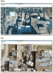
Bing has release an app that documents the massive damage from the May 22nd Joplin, Missouri tornado.  The new app is a part of Bing Maps, which has become a really nice competitor for Google Maps.  According the Bing team the photos come from “Surdex, one of our Global Ortho flying partners, captured these images 36 hours after the event at an amazing 7.5 cm resolution (which means each pixel represents an area about the size of a standard post-it note). Surdex is making these images freely available to government agencies as a public service (see their website for details).”

The app shows both before and after photos that document the sad damage of the massive EF-5 storm.  Users can flip back and forth between both the before and after shots to see the changes.

To access it, you can visit the Joplin Tornado app page.


MarineTraffic.com – Live Ships Map


MarineTraffic.com is a live map showing the location of shipping of 299 GT (gross tonnage) or over. Sounds boring but in fact it’s a totally awesome mashup of data. You can zoom into your local coast and see what’s pottering about or you can follow a ship in the news and see what’s happening to it.

Here’s what’s going on in the English Channel:

Here are the ships waiting to go through the Panama Canal.

You can also follow ships that are in the news. Here’s the MSC Opera which lost power in the Baltic and the tug Svitzer Trym in attendance. If you click on a ship you can get further details, including the speed and pictures of the vessel.

Finally, here’s one of the UK’s latest warships undergoing trials. HMS Dragon is a Type 45 destroyer.

There are additional clients for iPhone and Android users. And if you want to get notifications of what your favourite boats are doing, you can sign up for alerts and notifications.

Great resource if you want to see what’s going on, especially if you have a sea view and you want to know what’s floating past.


Typographic Maps


Boston Typography MapI love maps.  You look at an Ordnance Survey Landranger map and you see a thousand years of history, of exploration, of society, of geography all in single sheet of paper that you can fold up and put in your pocket.  GPS gives you directions but a map gives you a world.

Consequently, I was fascinated and delighted to see these typographic maps from Axis Maps.  Currently only available for Boston and Chicago, every feature that you’d expect to see has been created using just type.  So for roads and highways, you have a ribbon of text made from the street’s name.   The names of neighbourhoods fill in the blocks as subtle shading.  Trains and subways are picked out in the name of the line.

ChicagoIt’s taken the team at Axis Maps over two years to create the city maps – the idea started with a University of Wisconsin party invite – and the whole process is covered on their blog, along with lots more images.  They started with OpenStreetMap images and then carefully added text over the feature areas.  There was also great deal of copy’n’paste but the end result is worth it.

If you do go over to their website, click on some of the thumbnails – you’ll get a pop-up that expands and zooms the detail.

BostonChicago

The maps are available to purchase – $30 gets you a 2ft-ish x 3ft-ish print.  UK dwellers can purchase from zazzle.co.uk – just search for Axis Maps.  I’ll be ordering Chicago shortly.

All images copyright of Axis Maps LLC.