Tag Archives: Infographic

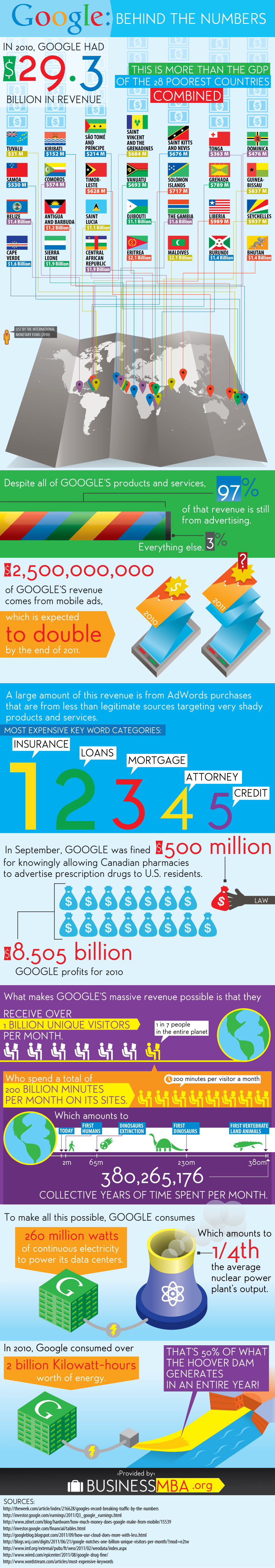
Infographic: The Tech World in 60 Seconds


A couple of days ago I stumbled across a new infographic (something I have a weakness for) that displayed some mind-boggling information about the tech world around us.  We know how fast things move in today’s world, but the numbers put forth here are simply staggering.  What happens in 60 seconds couldn’t have been envisioned by even the most imaginative sci-fi writer from the past.

Here are just a few statistics of a typical 60 seconds in today’s world.  1,820 TB of data is created.  More than 950 purchases are made on Ebay.  Google made $75,000.  11 Xbox 360’s are sold.  81 iPad’s are sold.

Those are just a few of the numbers depicted.  If you love statistics then you will love perusing this infographic, which is courtesy of Go Gulf Design.  You can check it out below, and click to enlarge it.

60 seconds infographic


Google Behind the Numbers


An interesting infographic pertaining to Google was posted over at Business MBA titled Google Behind the Numbers.  It’s a look at the revenue that Google collects and sources from which it comes.  The numbers are mind-boggling.

In 2010 Google’s revenue was $29.3 billion, more than the 28 poorest countries COMBINED!  Did you know that 97% of Google’s revenue comes from ads?  We knew that was their main business, but with all of the services it seems stunning that such a high percentage still comes from advertising.  Then again, the vast majority of those services, like Gmail, Docs, Maps, Calendar, and Music, are free.  All are monetized by displaying Google AdWords.

The massive numbers continue – displaying the amount of visitors, the time spent on Google sites, the power used, and more.  Scroll down through the infographic below and you’ll be amazed by the scale of this company that is barely a decade old.

Google Behind The Numbers
From: BusinessMBA.org


Laptop, Netbook, Smart Phone, Tablet – An Interactive Graphic


A new interactive infographic posted today gives a quick overview of the features of four different devices – a laptop, netbook, smartphone, and tablet.  If you are shopping for one of these devices this holiday season, and wondering which you should get, then the infographic linked below will give you a good starting point.  To get a general overview of what features are included with each type of device you can just hover your mouse over a device and the features it includes will be highlighted.  Hover over a feature and see which device it requires.

The infographic was posted by Chris Byrd, Corp Comm Social Media Team to the Dell blog.  Dell, of course, has a horse in this race – they make devices in all four categories.  However the graphic isn’t brand specific, but just gives an overview of features.  This by no means will tell you exactly what to buy, but it’s a cool, fun way to get you started in your shopping research.

Laptops, Netbooks, Phones & Tablets Interactive ComparisonLaptop, Netbook, Tablet, & Smartphone Comparison Interactive by Dell


Infographic: SEO Software Survey


Most everyone who has a website knows about, and worries about, search engine optimization (SEO).  There is certainly no shortage of tools available either, especially for WordPress users.  There are “all-in-one” solutions like All in One SEO Pack, Platinum SEO, and WordPress SEO.  There are niche solutions like SEO Smart Links, SEO Friendly Images, and many more.

Skyrocket SEO recently conducted a survey to see what tools people are actually using.  They put their results together and created an infographic that shows what the “experts” are using.  It provides some good insight into tools you may not have been familiar with and also into what the current thinking is and how fast these things move.  For instance, 85% would change software if something better came along.  BuzzStream tied MajesticSEO for the most used software with 32% usage, while only 7% used Screaming Frog.

The infographic is posted below (click to enlarge it).  If you have other tools or plugins that you use then let us know in the comments below.

seo software survey 2011


An Infographic Look at the History of Computer Languages


It’s amazing and surprising how long some computer languages have actually been around.  Beginning way back in 1957 with Fortran, which is still in use at the National Weather Service and moving to Cobol in 1959, which is used by the united States Postal Service.

The graphic below is courtesy of Rack Space.  It cover the history of the most popular programming languages from the aforementioned Fortran and Cobol right up through Ruby on Rails.  It also give a very brief bit of information about each and some information about who has implemented them.  At the bottom, you will find a chart that illustrates the popularity of each language.  It’s a fascinating snapshot that I found a few surprises in.  Did you know Skype was written in Pascal?  Or, that C++ is the most popular programming language ever?  Or, that PHP (the backbone of many web 2.0 sites) has been around since 1995?  It’s all in the infographic below.


Infographic: iPhone vs Android


While Android started off very slowly from it’s debut, it has become the leading smartphone OS.  Google recently claimed 500,000 activations per day.  Of course, their biggest rival in the market is Apple’s iPhone.  So, how do they stack up in a head-to-head comparison?

Tech Heavy recently published an infographic illustrating what a comparison of the two market giants looks like.  They hit the highlights, such as carriers, price, keyboard, screen size, battery, and durability.  Apple fans won’t be particularly happy by the findings, but most of the information in not really open to debate.  Keyboards, of course, are a personal choice, and durability is subjective, but thing like price and screen size don’t leave any room for argument.

You can view the infographic below and draw your own conclusions.  Put in the comments, because we would love to know what you think.


Infographic: Facebook vs Google+


I have spent a week on Google Plus (and quite a bit longer on Facebook) and haven’t really formed an opinion yet because most people I know still aren’t on Google Plus.  Until it’s open, and everyone can join, it’s hard to get a real feel for which you like better.  They both have their features, and many of those are very similar.

One indication may be that we have seen an inundation of tools that allow Facebook users to migrate their content over to Google Plus.  Is that an indicator that those on Google Plus prefer it?  Or, is it simply the newness of of Google Plus that is fascinating people?

Until the day that Google Plus opens to the world we will see endless comparisons.  I recently came across one that seems a lot more comprehensive than the others I have browsed through.  The folks over at The Tech Addicts put together an infographic that does a great job of illustrating the features of each service.  View it for yourself below and see what conclusions you can draw from it.